Introduction to Data Visualization in Python
Data visualization is a powerful way to present complex data in a simple and understandable format. It helps transform raw numbers into meaningful insights through charts and graphs. In fields like Data Science and Python, visualization plays a crucial role in analyzing trends and communicating results effectively.
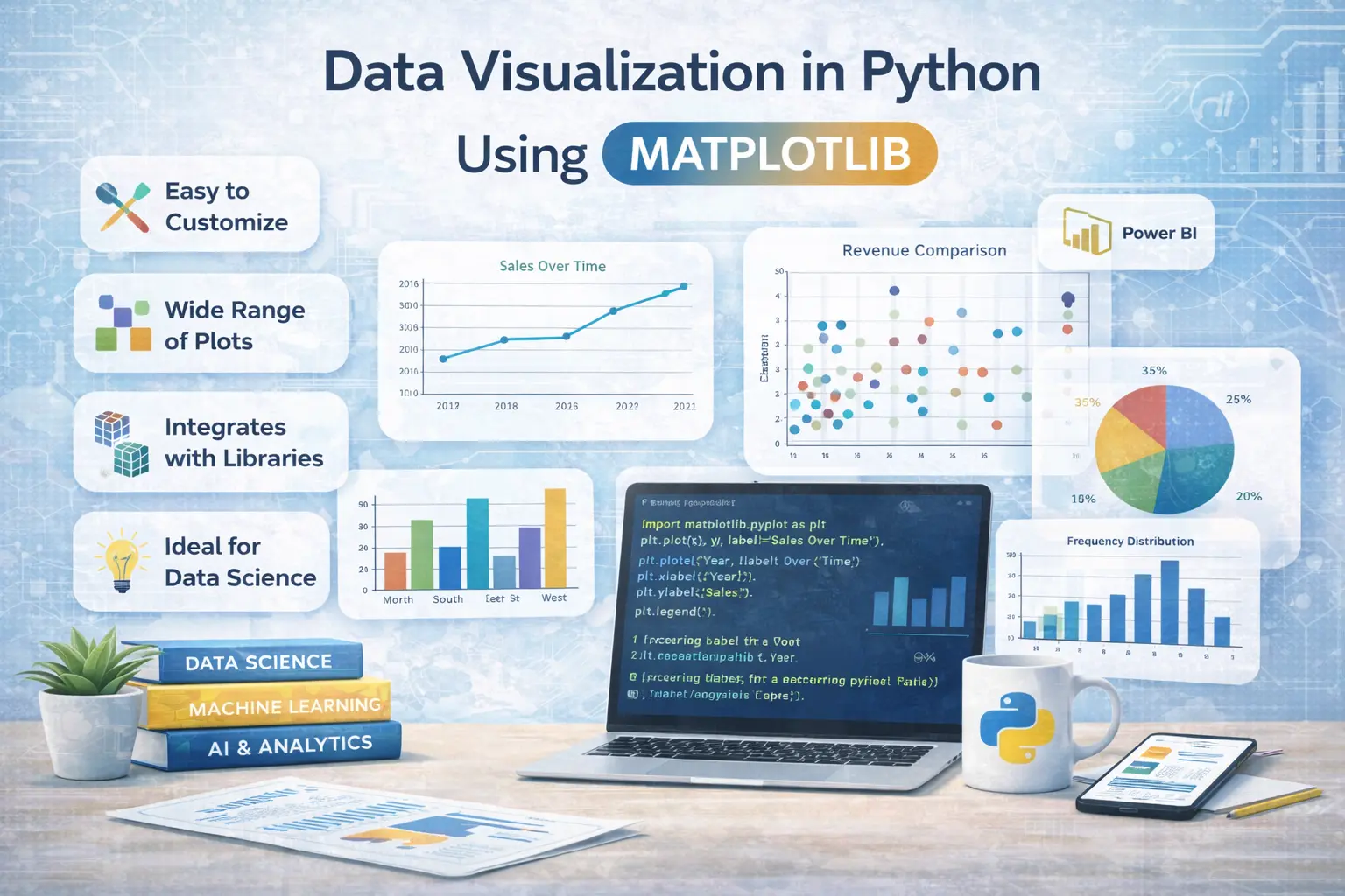
What is Matplotlib?
Matplotlib is one of the most widely used libraries for creating visualizations in Python. It provides a flexible platform for generating a wide range of plots, including line charts, bar graphs, and histograms. In data analytics and machine learning, Matplotlib is often the first choice for visualizing data.
Importance of Data Visualization
Data visualization helps in identifying patterns, trends, and relationships within datasets. It simplifies complex information and makes it easier to interpret. In AI and Data Science, visualization supports better decision-making by presenting insights clearly and visually.
Types of Plots in Matplotlib
Matplotlib offers various types of plots such as line plots, bar charts, scatter plots, and pie charts. Each type serves a specific purpose depending on the data being analyzed. In Python and data analytics, choosing the right plot type is essential for an accurate representation of data.
Creating Basic Plots with Matplotlib
Creating a basic plot in Matplotlib involves importing the library, preparing the data, and using simple functions to generate visuals. It is easy to customize plots with titles, labels, and colors. In Data Science and Python, this simplicity makes Matplotlib a beginner-friendly tool.
Customizing Visualizations
Matplotlib allows extensive customization options such as changing colors, styles, and layouts. Users can add legends, grid lines, and annotations to enhance clarity. In machine learning and data analytics, customized visuals help present data in a more professional and engaging way.
Integration with Other Libraries
Matplotlib works seamlessly with other Python libraries like NumPy and Pandas. This integration makes it easier to handle data and create visualizations in a single workflow. In Data Science and AI, combining these tools improves efficiency and productivity.
Use Cases of Matplotlib
Matplotlib is used in various applications such as financial analysis, scientific research, and business reporting. It helps visualize performance metrics and trends over time. In data analytics and Power BI, it is often used to prepare data before creating dashboards.
Advantages of Using Matplotlib
Matplotlib is highly flexible, easy to use, and widely supported by the community. It provides full control over visualization elements, making it suitable for both simple and complex tasks. In Python and Data Science, its versatility makes it a preferred choice among professionals.
Conclusion on Data Visualization with Matplotlib
Data visualization using Matplotlib is an essential skill for anyone working with data. It enhances understanding and helps communicate insights effectively. In fields like Data Science, AI, and machine learning, mastering visualization tools like Matplotlib is key to delivering impactful results.